Studio| 5 THE REALLY RUBBISH INTERACTION - 1 (RRI) CHALLENGE
1. Student ID card Reactivation System
The student ID is
for student to use on the different places in the campus like borrowing
books at the library, also entrance on the lifts. The thing happen to me is
that, twice I was trying getting in the lift my card didn't work I had to find
the card activation point which it was outside the building or i had to take the
stairs and I was already late for the lab session. And on another time I was
borrowing the book at the library and it done the same problem and I was at the
third floor, so I had to go to the ground floor to activate the card and borrow
the books. This system of activating the student ID cards is really the hustle as we
student have a lot of things we have to concentrate on the study, sometimes
you can’t remember activating your ID card and when you are in the hurry
you get stuck somewhere.
The Solution
The solution
here, I think is to activate the student IDs automatically in the system so that
nobody have to think of reactivating their ID cards, or to have the system that
once you activate your ID that's it you don't need to do anything after that.
 |
| Student ID Card Reactivation Point. |
Student ID CardSTUDIO 6| REAL RUBBISH INTERACTION -2 ATM Cash Machine
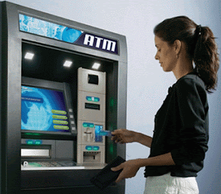
At the ATM cash machine we expect to access our bank accounts in order
to take cash withdraw, check the account balance, top up our mobile phones and
even deposit our money in the account now days.
One day I had bad experience with a cash machine. I put the card in the
machine and go all through the steps up to where the money need to come out,
then the message pop up and say that “This transaction has been cancelled”,
this is really rubbish. I have gone through all the process and at the end I didn't get the money.
In another occasion, my friend experiences another problem.
she went to take the money, at the screen there a message ask her to choose
what she want to do, if she want to withdraw money or check balance etc. but
the buttons and where she need to press is not in the same line, that really
confusing.
Solution
My view here is that they should have something quite clear on the
machine that informs you that there is no money in the machine from the beginning,
so that you don’t have to go through all the steps and west your time. Sometimes
you are in the rush. This system they have is not good at all.
For screen issue here the button needs to be in the same
line as the lines of the information on the screen, so that you will know where
to press for which information.
 |

